anon_neby said in #3629 13mo ago:
https://www.macrumors.com/guide/ios-26-beta-3-liquid-glass-changes/
(God forgive me for posting an OP link to macrumors)
For those living under a rock, Apple recently released a new design system they call liquid glass. It is present in the iOS 26 beta, which I've been using as an exercise. The beta v1 had unadulterated liquid glass, but they have since been walking it back and in beta v3 many of the occurrences have been nerfed to something more like a naive opacity. My highly controversial opinion after continued usage: backing off of the original vision is a big mistake, because full-send liquid glass and the general paradigm it represents is the future. And boy is the future gonna be good.
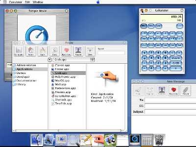
As a matter of historical analogue, Apple introduced the aqua interface in 2000, which had a very similar visual identity to liquid glass. Since the very early days of computing we have known that blur is computationally expensive, so various hacks were culturally embedded like the aforementioned naive opacity and/or clever use of pngs that look like artifacts you would see in a bonafide object that was made of glass or tinted acrylic. In video games we have lighting approximations like Phong for highlights, etc.
Jonathan Blow observed that although hardware has been improving at an exponential rate, GUI software looks/works much like it did in the 90s (i.e. bad/poorly). We are in a pretty deep potential well of HTML, CSS, and JS and have been for decades. To first approximation, video games have been the only alternative domain to the web for technical aesthetic expression, and their absolute spiritual supremacy is undeniable. They have the mandate of heaven.
Over the past few years we've started to see some interesting things happen with the web, like WASM and WebGL. A few companies have taken advantage of these, the most notable is probably Figma (IPOing soon). Their stuff all runs in the browser and yet feels like a video game because it is written like a video game and takes advantage of hardware like a video game. In general the trend is that despite web devs being mostly incompetent idiots, there is a clade of priests advancing the technical aesthetics of video game development into the web, and they are being rewarded handsomely by Gnon for their superior interpretation of His will.
We now return to liquid glass, aka the Linux ricer's wet dream. The shaders Apple is using, assuredly implemented in their proprietary Metal Shading Language (MSL), are glorious. Dynamic chromatic aberration, specularity, physically accurate refraction, I mean it's a proper scientific testament to Beauty. In beta v1 it was on nearly every control surface of the entire operating system, and it didn't even nuke battery life all that much. Remarkable, thank you very much TSMC. Vertex and fragment shaders decide every pixel of every frame buffer in video games, and they are deciding an increasing number of pixels in every frame buffer of all modern computational interfaces.
We must thank God for that. I have written enough CSS and HTML to satisfy one hundred lives. Please, no more. The graphics frontier is reopening after a long hiatus, and once again Aryan Intelligence (AI) may dominate Computer—this time around with Rust and GLSL. I humbly conclude this screed with a few glorious references to shader-as-art:
https://x.com/XorDev/status/1943750402387648778
https://x.com/XorDev/status/1937221326327963657
https://x.com/zachlieberman/status/1933969965788393885/photo/1
https://x.com/zachlieberman/status/1929626460853358711/photo/1
https://x.com/YoheiNishitsuji/status/1931100986220945776
https://x.com/YoheiNishitsuji/status/1889106921330016668
(God forgive me for posting an OP link to macrumors)
For those living under a rock, Apple recently released a new design system they call liquid glass. It is present in the iOS 26 beta, which I've been using as an exercise. The beta v1 had unadulterated liquid glass, but they have since been walking it back and in beta v3 many of the occurrences have been nerfed to something more like a naive opacity. My highly controversial opinion after continued usage: backing off of the original vision is a big mistake, because full-send liquid glass and the general paradigm it represents is the future. And boy is the future gonna be good.
As a matter of historical analogue, Apple introduced the aqua interface in 2000, which had a very similar visual identity to liquid glass. Since the very early days of computing we have known that blur is computationally expensive, so various hacks were culturally embedded like the aforementioned naive opacity and/or clever use of pngs that look like artifacts you would see in a bonafide object that was made of glass or tinted acrylic. In video games we have lighting approximations like Phong for highlights, etc.
Jonathan Blow observed that although hardware has been improving at an exponential rate, GUI software looks/works much like it did in the 90s (i.e. bad/poorly). We are in a pretty deep potential well of HTML, CSS, and JS and have been for decades. To first approximation, video games have been the only alternative domain to the web for technical aesthetic expression, and their absolute spiritual supremacy is undeniable. They have the mandate of heaven.
Over the past few years we've started to see some interesting things happen with the web, like WASM and WebGL. A few companies have taken advantage of these, the most notable is probably Figma (IPOing soon). Their stuff all runs in the browser and yet feels like a video game because it is written like a video game and takes advantage of hardware like a video game. In general the trend is that despite web devs being mostly incompetent idiots, there is a clade of priests advancing the technical aesthetics of video game development into the web, and they are being rewarded handsomely by Gnon for their superior interpretation of His will.
We now return to liquid glass, aka the Linux ricer's wet dream. The shaders Apple is using, assuredly implemented in their proprietary Metal Shading Language (MSL), are glorious. Dynamic chromatic aberration, specularity, physically accurate refraction, I mean it's a proper scientific testament to Beauty. In beta v1 it was on nearly every control surface of the entire operating system, and it didn't even nuke battery life all that much. Remarkable, thank you very much TSMC. Vertex and fragment shaders decide every pixel of every frame buffer in video games, and they are deciding an increasing number of pixels in every frame buffer of all modern computational interfaces.
We must thank God for that. I have written enough CSS and HTML to satisfy one hundred lives. Please, no more. The graphics frontier is reopening after a long hiatus, and once again Aryan Intelligence (AI) may dominate Computer—this time around with Rust and GLSL. I humbly conclude this screed with a few glorious references to shader-as-art:
https://x.com/XorDev/status/1943750402387648778
https://x.com/XorDev/status/1937221326327963657
https://x.com/zachlieberman/status/1933969965788393885/photo/1
https://x.com/zachlieberman/status/1929626460853358711/photo/1
https://x.com/YoheiNishitsuji/status/1931100986220945776
https://x.com/YoheiNishitsuji/status/1889106921330016668
referenced by: >>3631
(God forgive me for